Theme
Switch the application visual theme between light and dark mode. The preference is persisted in localStorage and applies globally — no per-page configuration is needed.
Where to find it
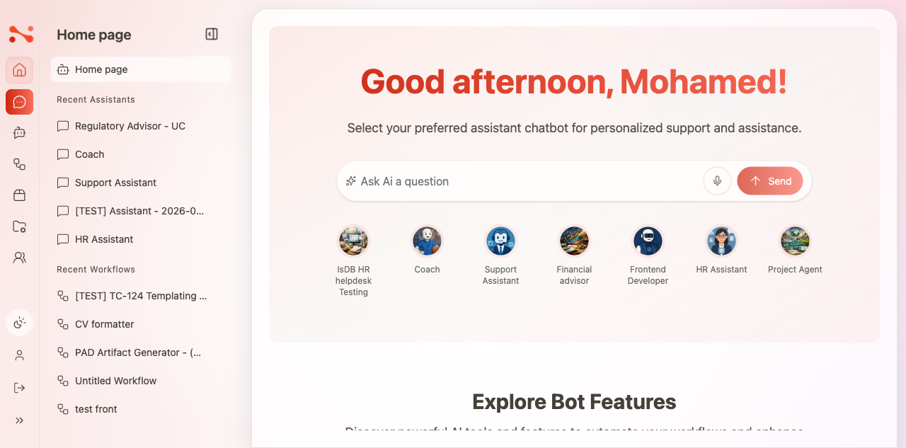
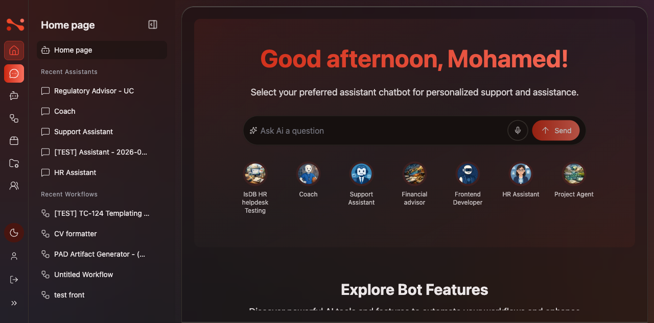
The theme toggle is the sun/moon icon in the bottom section of the sidebar, present on every page.
Theme states
The toggle cycles through three states (not a simple binary switch):
| State | Visual | Icon | localStorage["BOT_THEME"] |
|---|---|---|---|
| Default/System | Light (follows OS) | Sun-Moon | "default" |
| Light (forced) | Light (always) | Sun | "Light" |
| Dark | Dark (always) | Moon | "Dark" |
Cycle order: Dark → Default/System → Light → Dark → …
note
"Default/System" and "Light (forced)" are visually identical (light background, dark text). They differ only in intent: Default follows the OS preference, while Light forces light mode regardless of OS setting.
Switching theme
- Click the sun/moon icon in the sidebar.
- The theme advances to the next state in the cycle.
- The icon updates to reflect the new state.
- All UI elements switch instantly — no page reload needed.
- The preference is saved to
localStorage["BOT_THEME"]and persists across navigation and page reloads.
Default behaviour
When no theme preference is stored:
- The app starts in Default/System state (
"default") - The sun-moon icon is shown
Business rules
| Rule | Behaviour |
|---|---|
| Toggle always visible | Present in the sidebar bottom nav on every page |
| 3-state cycle | Dark → Default/System → Light → Dark |
| Applies globally | Theme class on <html> affects the entire app |
| Persisted in localStorage | Survives navigation and page reload |
| Default is system/light | "default" state when no preference is stored |
| Icon reflects current state | Moon = Dark, Sun-Moon = Default/System, Sun = Light |
| Instant switch | No page reload required |